
@vuese/cli
A command line tool to quickly generate a documentation site or markdown file for your vue component.
Global install:
yarn global add @vuese/cli
This makes the vuese command globally available.
Motivation
Let's talk a little bit before starting, why do I have to do this project.
Previously, when you created a Vue component, you needed to manually document your component, including:
props: Whichpropsyour component receives, and theirtype,defaultvalue, whetherrequired, etc.events: What events are provided by your component, as well as the parameters of the event callback function.slots: Whatslotsare provided by your component, what do they mean?methods: Sometimes your component will also provide methods that allow external calls through component instances.
In addition to manually writing the above, the most painful thing is to write the markdown file itself. Of course, you can use some WYSIWYG editing tools, but is it better to generate it automatically?
So I created this project.
Quick start
Assuming your project is structured as follows:
root
├── src
├──├──  components
├──├──├──  Button.vue
├──├──├──  ButtonGroup.vue
Run the following command in the root directory:
vuese gen
At this time, you will find the website directory in your project root directory as follows:
root
├── src
├──├── components
├──├──├── Button.vue
├──├──├── ButtonGroup.vue
├── website
├──├── index.html
├──├── components
├──├──├── Button.md
├──├──├── ButtonGroup.md
Then continue to run the following command:
vuese serve --open
This creates a server for the previously generated document website and opens the browser. Congratulations, you already have the documentation for the component, a preview:
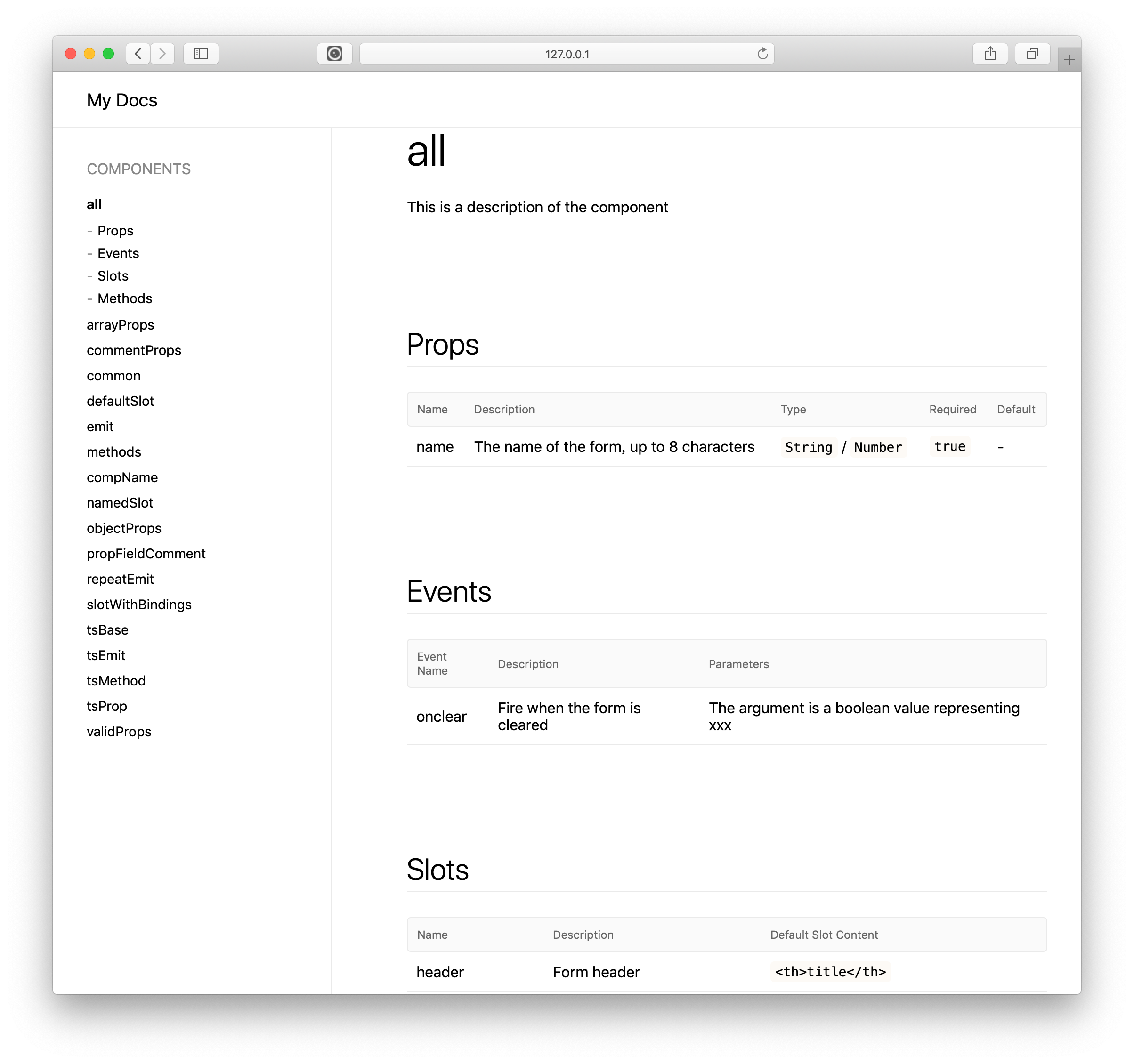
Writing documentation for your component
The process of writing a document is actually adding comments to your code.
props
Assumed we have a prop called someProp:
props: {
  someProp: {
    type: String
  }
}
In the absence of any comments circumstances, vuese produces the following table:
| Name | Description | Type | Required | Default |
|---|---|---|---|---|
| someProp | - | String | false | - |
You can see that the prop named someProp is missing the description, you just need to add a leading comment to the someProp property:
props: {
  // The name of the form
  someProp: {
    type: String
  }
}
Then look again at the generated table:
| Name | Description | Type | Required | Default |
|---|---|---|---|---|
| someProp | The name of the form | String | false | - |
In addition, we also noticed that the value of the type(Type) column in the table is String, which is automatically obtained from the type property of someProp, but sometimes you want to explicitly show that which values are available for selection. Quite simply, you just need to add a leading comment to the type attribute, as follows:
props: {
  // The name of the form
  name: {
    // `'TOP'` / `'BOTTOM'`
    type: String
  }
}
Then look again at the generated table:
| Name | Description | Type | Required | Default |
|---|---|---|---|---|
| someProp | The name of the form | 'TOP' / 'BOTTOM' | false | - |
You can also specify a default value for someProp:
props: {
  // The name of the form
  name: {
    // `'TOP'` / `'BOTTOM'`
    type: String,
    required: true,
    default: 'TOP'
  }
}
Generated the following table:
| Name | Description | Type | Required | Default |
|---|---|---|---|---|
| someProp | The name of the form | 'TOP' / 'BOTTOM' | false | 'TOP' |
TIP
You can also customize the default value by adding a leading comment to the default property.
props: {
  // The name of the form
  name: {
    // `'TOP'` / `'BOTTOM'`
    type: String,
    required: true,
    // The default value is: `TOP`
    default: 'TOP'
  }
}
| Name | Description | Type | Required | Default |
|---|---|---|---|---|
| someProp | The name of the form | 'TOP' / 'BOTTOM' | false | The default value is: TOP |
The rules are simple
When using Vuese to generate a document, if you want to customize the content of the document, add a leading comment to it.
slots
Slots in the template
Assumed your template has a named slot, and the slot has default content, as follows:
<slot name="header">
  <th>title</th>
</slot>
The table generated by Vuese is as follows:
| Name | Description | Default Slot Content |
|---|---|---|
| header | - | - |
You can see that the slot named header has no description(Description) and there is no description of the default slot content, in which case you only need to add a leading comment to it:
<!-- Form header -->
<slot name="header">
  <!-- `<th>title</th>` -->
  <th>title</th>
</slot>
Generated the following table:
| Name | Description | Default Slot Content |
|---|---|---|
| header | Form header | <th>title</th> |
Sometimes you may encounter nested slots:
<!-- Form header -->
<slot name="header">
  <!-- `<th>title</th>` -->
  <slot name="defaultHeader"></slot>
</slot>
Note that the comment content <!-- `<th>title</th>` --> is a leading comment for the defaultHeader slot, but it is not a description of the defaultHeader slot. It is still a description of the default content of the header slot. In order to add a description to the defaultHeader slot, you need to add another leading comment to it:
<!-- Form header -->
<slot name="header">
  <!-- `<th>title</th>` -->
  <!-- Custom form header -->
  <slot name="defaultHeader"></slot>
</slot>
At this time, the generated table is as follows:
| Name | Description | Default Slot Content |
|---|---|---|
| header | Form header | <th>title</th> |
| defaultHeader | Custom form header | - |
Slots in scripts
[TODO]
events
Events in script
Assumed we have the following code:
methods: {
  clear () {
    this.$emit('onclear', true)
  }
}
vuese will generate the following table for it:
| Event Name | Description | Parameters |
|---|---|---|
| onclear | - | - |
Just add a leading comment to it:
methods: {
  clear () {
    // Fire when the form is cleared
    this.$emit('onclear', true)
  }
}
The generated table is as follows:
| Event Name | Description | Parameters |
|---|---|---|
| onclear | Fire when the form is cleared | - |
If you want to describe the parameters of the callback function, you need to use the @arg annotation:
methods: {
  clear () {
    // Fire when the form is cleared
    // @arg The argument is a boolean value representing xxx
    this.$emit('onclear', true)
  }
}
The generated table is as follows:
| Event Name | Description | Parameters |
|---|---|---|
| onclear | Fire when the form is cleared | The argument is a boolean value representing xxx |
Events in template
[TODO]
.sync event
If the component's prop is designed to be .sync, an event named update:xxx will usually be included in your component code, for example:
this.$emit('update:some-prop', true)
But for users, they don't care about such events, so we deliberately don't include such events in the generated documentation.
v-model event
[TODO]
methods
Assumed we have the following methods:
methods: {
  clear (bol) {
    // ...
  }
}
For the above code, vuese will not generate documentation for it, because: ** In the design of the component, the method is mostly used internally, and of course, in some cases, it is also useful to expose the methods of a component instance to the outside. In order for vuese to generate documentation for the method, you need to use the @vuese annotation to actively tell vuese: "This method is designed for component users", as follows:
methods: {
  // @vuese
  clear (bol) {
    // ...
  }
}
At this time, the generated form is as follows:
| Method | Description | Parameters |
|---|---|---|
| clear | - | - |
To describe the method and its parameters, you can add comments to it, the rules are the same as events:
methods: {
  // @vuese
  // Used to manually clear the form
  // @arg The argument is a boolean value representing xxx
  clear (bol) {
    // ...
  }
}
Of course, if you dislike the single-line comment that looks uncomfortable, you can use the block comment:
methods: {
  /**
   * @vuese
   * Used to manually clear the form
   * @arg The argument is a boolean value representing xxx
   */
  clear (bol) {
    // ...
  }
}
The generated table is as follows:
| Method | Description | Parameters |
|---|---|---|
| clear | Used to manually clear the form | The argument is a boolean value representing xxx |
Class-style Components
@Component
If you use vue-class-component, all options in the @Component decorator will be parsed, and the parsing rules are the same as described above. This is because the argument to the @Component decorator is itself the vue component option object, as follows:
@Component({
  props: {
    // The name of the form, up to 8 characters
    name: {
      type: [String, Number],
      required: true,
      validator () {}
    }
  },
  methods: {
    // @vuese
    // Used to manually clear the form
    /**
     * @arg The first parameter is a Boolean value that represents...
     */
    clear () {
      // Fire when the form is cleared
      // @arg The argument is a boolean value representing xxx
      this.$emit('onclear', true)
    }
  }
})
export default class Child extends Vue {}
It will be parsed correctly 🎉.
Class Method
After using vue-class-component, the class method becomes the methods of the component, which can be parsed by vuese and the parsed rules are unchanged:
@Component
export default class Child extends Vue {
  /**
   * @vuese
   * This is a function exposed as an interface
   *
   * @arg The first parameter is a Boolean value that represents...
   */
  someMethod(a) {

  }
}
The generated table is as follows:
| Method | Description | Parameters |
|---|---|---|
| someMethod | This is a function exposed as an interface | The first parameter is a Boolean value that represents... |
Usually, we will use vue-class-component and vue-property-decorator at the same time, because vue-property-decorator provides a lot of useful property decorators, of which we only focus on @Prop and @Emit.
@Prop
As with the rules mentioned above, you only need to add a leading comment to the @Prop decorator:
@Component
export default class Child extends Vue {
  // Description of prop
  @Prop(Number)
  a: number

  @Prop([Number, String])
  b: number | string

  @Prop({
    type: Number,
    // The default value is 1
    default: 1,
    required: true
  })
  c: number
}
The generated table is as follows:
| Name | Description | Type | Required | Default |
|---|---|---|---|---|
| a | Description of prop | Number | false | - |
| b | - | Number / String | false | - |
| c | - | Number | true | The default value is 1 |
@Emit
You only need to add a leading comment to the @Emit decorator, the rules are the same as the events mentioned above:
@Component
export default class Child extends Vue {

  // Fire when the form is cleared
  // @arg The argument is a boolean value representing xxx
  @Emit()
  onClick() {}

  @Emit('reset')
  resetHandle() {}
}
The generated table is as follows:
| Event Name | Description | Parameters |
|---|---|---|
| on-click | Fire when the form is cleared | The argument is a boolean value representing xxx |
| reset | - | - |
TIP
Note that if no arguments are passed for the @Emit() decorator, the function name is converted to a hyphen and used as the name of the event.
mixins 2.2.0+
Vuese will generate documents for the mixins option in your component, assuming we have the following code
export default {
  mixins: [MixinA, MixinB, MixinC]
}
The generated table is as follows:
| MixIn |
|---|
| MixinA |
| MixinB |
| MixinC |
jsx / tsx
[TODO]
Group 2.1.0+
If you are generating a Docute document, you can group the components, as shown in the following figure:
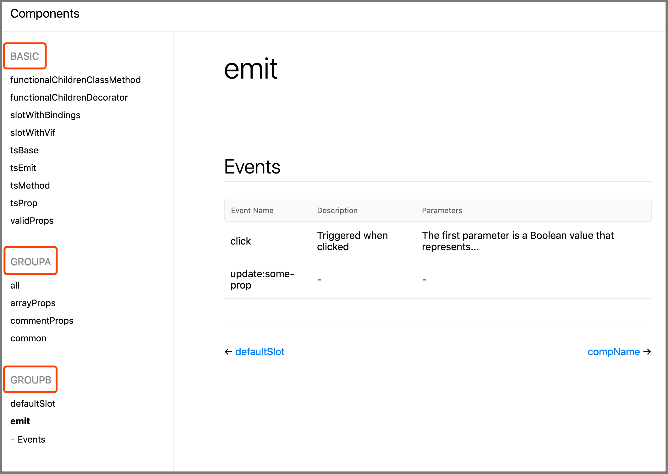
Grouping shows is simple, just add @group [GroupName] leading comments to your component definition, as shown in the following code:
// @group GroupA
export default {
  // ...
}
If you do not specify a group name, the component is automatically categorized under the BASIC group.
TIP
Grouped names are converted to uppercase letters.
Also available for class-style components:
@Component({
  // ...
})
// @group GroupD
export default class Child extends Vue {}
Description of the component
As a document, you should use a single sentence to introduce the purpose of the component to the user, and Vuese will also generate a description of the component for you, simply by adding regular leading comments to the component definition, as follows:
// This is a description of the component
export default {
  // ...
}
Of course, this does not conflict with grouping(@group):
// This is a description of the component
// @group GroupA
export default {
  // ...
}
Or use multiple lines of comments:
/**
 * @group GroupA
 * This is a description of the component
 */
export default {
  // ...
}
Also available for class-style components:
@Component({
  // ...
})
/**
 * @group GroupA
 * This is a description of the component
 */
export default class Child extends Vue {}
Precautions
WARNING
When the component does not have any props, slots, events, and methods(using @vuese), vuese does not generate documentation for it.
You can change this default behavior, you need to ensure that the component meets the following two conditions:
- 1、Use the
@vueseannotation on the component definition, for example:
// @vuese
export default {
  // ...
}
Or in TypeScript:
// @vuese
export default class ActionBar extends Vue {
  // ...
}
- 2、In addition to adding the
@vueseannotation to the component definition, you must ensure that the component has thenameoption:
// @vuese
export default {
  name: 'MyComponent'
}
In TypeScript:
@Component({
	name: 'MyComponent'
})
// @vuese
export default class MyComponent extends Vue {
  // ...
}
After the component satisfies the above two conditions, even if the component does not have any props、slots、 events、and methods(using @vuese), vuese will still generate documentation for it. Of course, only the component's name and description will be included in the document.
Quick preview of a component
If you don't want to generate a document, but just want to quickly preview a component as a document, of course, run the following command:
vuese preview path-to-your-component.vue
vuese uses puppeteer-core internally, and when the previewed component changes, the document is updated in real time.
As shown below:
Use configuration file
vuese will search vuese.config.js or .vueserc or vuese property in package.json from your base directory. The following options can be used both on the command line and in the configuration file.
genType
- Type:
'docute'|'markdown' - Default:
'docute'
Specify the type of generated document. If the value is the string 'docute', it means that you are generating a docute document. If the value is 'markdown', it means only the markdown file is generated.
title
Only
--genType="docute"
- Type:
string - Default:
'Components'
Specifies the title of the sidebar that generates the docute document.
include
- Type:
stringstring[] - Default:
["**/*.vue"]
Specify which .vue files need to be generated, and by default include all .vue files in the current directory and subdirectories.
exclude
- Type:
stringstring[] - Default:
[]
Specify which .vue files do not need to be documented.
TIP
node_modules/**/*.vue is excluded by default.
outDir
- Type:
string - Default:
website
Output directory of the docute document.
markdownDir
- Type:
string| '*' - Default:
components
Specify the output directory of the markdown file. Note that markdownDir is based on outDir, which means that the markdown file will be output to the website/components directory by default.
Sometimes, you want the component's markdown document to be generated in the same directory as the component. You can set the value of markdownDir to the string '*', assuming your directory structure is as follows:
root
├── src
├──├──  components
├──├──├──  Button.vue
├──├──├──  ButtonGroup.vue
After the document is generated, you will get:
root
├── src
├──├──  components
├──├──├──  Button.vue
├──├──├──  Button.md
├──├──├──  ButtonGroup.vue
├──├──├──  ButtonGroup.md
markdownFile 2.3.0+
- Type:
string - Default:
''
TIP
Only valid when genType: markdown and markdownDir: *.
It is used to specify the name of the generated markdown file, and it is useful when you want to generate documents of the same name for different components. For example, your directory structure is as follows:
root
├── src
├──├──  components
├──├──├──  Button
├──├──├──├──  index.vue
├──├──├──  ButtonGroup
├──├──├──├──  index.vue
If you do not specify markdownFile, the result is as follows:
root
├── src
├──├──  components
├──├──├──  Button
├──├──├──├──  index.vue
├──├──├──├──  index.md
├──├──├──  ButtonGroup
├──├──├──├──  index.vue
├──├──├──├──  index.md
You can specify markdownFile: README through a configuration file or command line, and the result is as follows:
root
├── src
├──├──  components
├──├──├──  Button
├──├──├──├──  index.vue
├──├──├──├──  README.md
├──├──├──  ButtonGroup
├──├──├──├──  index.vue
├──├──├──├──  README.md
babelParserPlugins
- Type:
object - Default:
{
  objectRestSpread: true,
  dynamicImport: true,
  'decorators-legacy': true,
  classProperties: true,
  typescript: true,
  jsx: true
}
Vuese uses @babel/parser to parse the <script> language block, and the babelParserPlugins option accepts all optional values in @babel/parser 的 plugsins, which gives you the mechanism to customize the parsing behavior based on your project. For example: By default both babelParserPlugins.jsx and babelParserPlugins.typescript are true, which means that vuese handles TS and TSX correctly by default, but does not correctly handle the following types assertions:
(<any>this).$refs.navBar.offsetHeight
You should use the as operator instead:
(this as any).$refs.navBar.offsetHeight
This is because TypeScript disallows angle bracket type assertions in the .tsx file, but you may not use tsx, you can disable it by specifying jsx: false in the .vueserc configuration file, this will allow angle bracket type assertions:
// .vueserc
{
  // ...
  babelParserPlugins: {
    jsx: false
  }
}
About comments
When you get here, you should understand what is: ** The process of writing a document is to write comments for your code**. In fact, without any comments, vuese has gotten any information it can get. Comments are just a means of providing more information, vuese tries to reduce the use of annotations(@xxx), the purpose is to reduce the cost of learning. In other words, you don't need to spend a lot of time to remember a lot of annotations.
All processes should be natural.
Take methods as an example:
methods: {
  clear (bol) {}
}
Without any comments, vuese only knows that the method name is clear, it does not know if this method needs to be provided to the user of the component, and does not know the purpose of the method, and does not know what the parameters received by this method represent. So very natural, use the @vuese annotation to call vuese and tell it that this method requires it to generate documentation for it, in order for vuese to know the purpose of the method, we added a line of comments that don't contain annotations. Then add a line of comments to tell vuese what the purpose of the method's parameters is, in order to distinguish the description of the parameter from the description of the function, we need to add the @arg annotation before the description of the parameter. Still, everything is natural.
Another thing to clarify is that comments are unordered, and the following two comments have the same meaning:
methods: {
  // @vuese
  // Used to manually clear the form
  // @arg The argument is a boolean value representing xxx
  clear (bol) {
    // ...
  }
}
methods: {
  // Used to manually clear the form
  // @arg The argument is a boolean value representing xxx
  // @vuese
  clear (bol) {
    // ...
  }
}
In addition, the types of comments are not limited, you can use line comments, you can also use block comments, or even mix them:
methods: {
  // @arg The argument is a boolean value representing xxx
  /**
   * @vuese
   * Used to manually clear the form
   */
  clear (bol) {
    // ...
  }
}
Because for vuese, this is just three lines of plain text:
@arg The argument is a boolean value representing xxx
@vuese
Used to manually clear the form
If your description is rather lengthy:
methods: {
  // @arg The first parameter represents xxx and the second parameter represents xxx
  // This function can be used for xxx and can also be used for xxx
  clear (bol) {
    // ...
  }
}
You can also split them up:
methods: {
  // @arg The first parameter represents xxx
  // @arg and the second parameter represents xxx
  // This function can be used for xxx and
  // can also be used for xxx
  clear (bol) {
    // ...
  }
}
The effect before and after splitting is the same 🙂.
Incremental update
[TODO]
Integrate into existing documents
[TODO]